The branding for LIFT Private Training wasn’t just about fitness; it was about the psychology of the “upward trajectory.” In a saturated market of generic gym logos, the goal was to create a visual identity that felt like a high-performance machine—precise, powerful, and exclusive.
1. The Geometry of the “A”
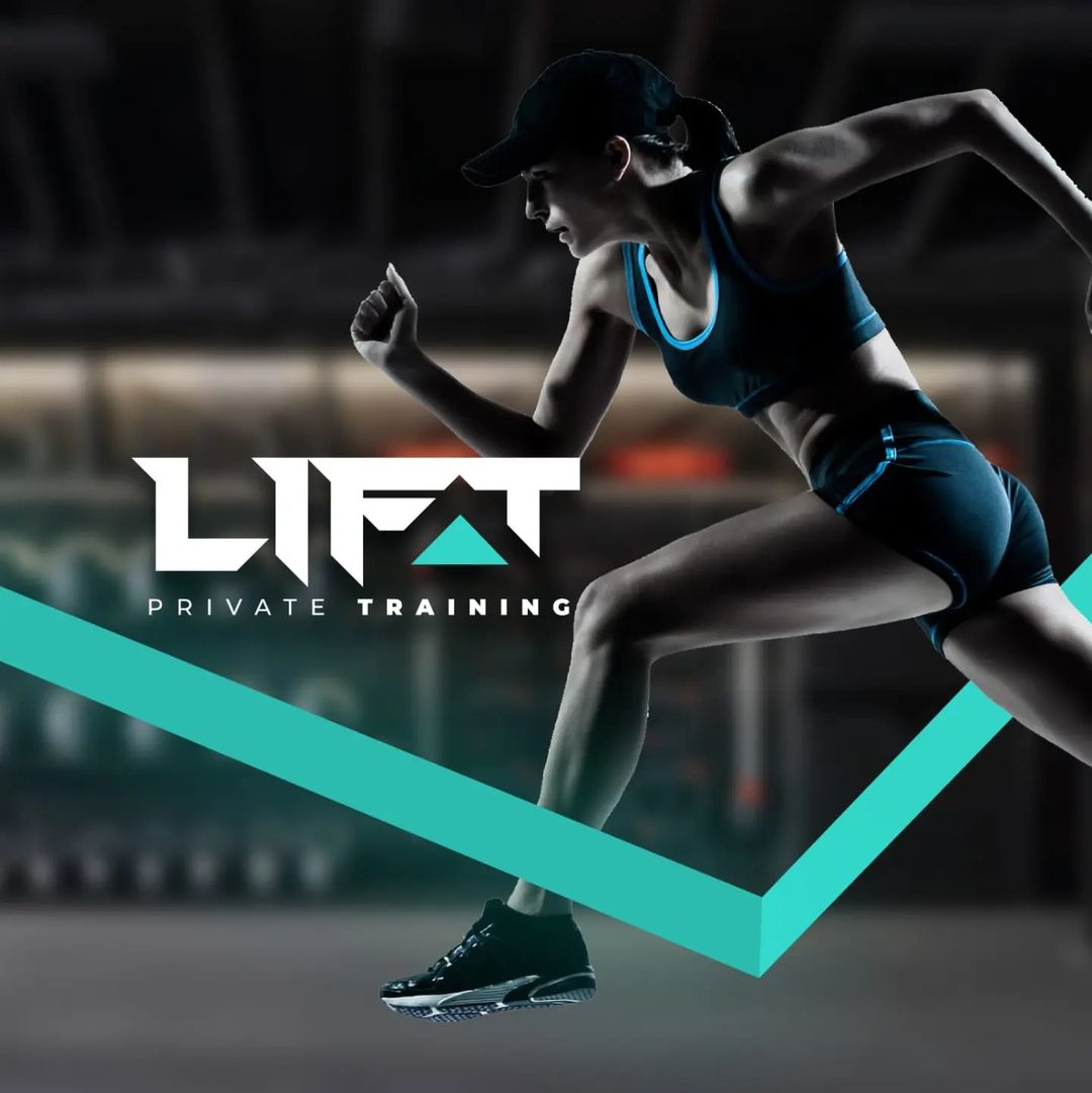
The centerpiece of the logo is the stylized “A” in LIFT. Rather than a traditional letterform, it is designed as a directional arrowhead. This represents the “Pivot Point”—the exact moment a client decides to change their lifestyle. By using a bold teal/cyan accent here, we draw the eye immediately to the concept of progress.
2. The Power of High-Contrast
The color palette—Matte Black, Crisp White, and Electric Teal—was chosen to evoke a “Dark Mode” aesthetic. This mirrors the atmosphere of a private, elite training studio:
- Black: Represents the grit, the sweat, and the focus of a private session.
- Electric Teal: Symbolizes the spark of energy and the modern technology used in personalized data tracking.
3. Typography as Strength
The custom typeface features heavy weights and sharp angles. Notice the “L” and “T” are sliced with aggressive diagonals. This isn’t just for style; it suggests movement and speed. It tells the client that this isn’t a place where you plateau—it’s a place where you accelerate.
4. The Visual “Pulse”
The graphic element cutting across the imagery (the teal chevron) acts as a Visual Pulse. It breaks the frame, suggesting that the results achieved at LIFT don’t just stay in the gym—they spill over into every other aspect of a client’s high-performance life.
Ready to transform your business? Connect with thecreativeagencylb, one of the TCA top digital marketing agencies lebanon serving the entire Mena region. Contact us today.