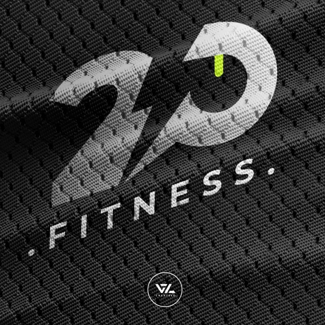
This logo for “2P Fitness” has a much more “streetwear” and “industrial” edge compared to the last one. It feels gritty, raw, and highly energetic—perfect for a brand that focuses on intensity and community.
Here is a story crafted for your portfolio that highlights the urban, high-voltage nature of this design.
The Concept: High-Voltage Performance
The branding for 2P Fitness was built around the idea of “The Spark.” In fitness, the hardest part is the transition from rest to action—the electrical impulse that tells your muscles to move. This visual identity captures that raw, kinetic energy.
1. The Monogram of Power
The “2P” monogram is the core of the identity. By merging the two characters into a singular, flowing shape, we represent the seamless connection between Physical and Power. The sharp, lightning-bolt-style negative space cutting through the middle serves as a literal representation of energy and “the spark” of motivation.
2. The Acid Neon Accent
Against the monochromatic mesh background, the single Acid Green/Yellow drop serves as a “visual jolt.” In a world of safe corporate colors, this neon pop signifies:
- Intensity: This isn’t a casual workout; it’s high-voltage.
- Precision: The placement suggests a digital or technical “active” state, like a power indicator on high-end hardware.
3. Texture & Tactility
The use of the Athletic Mesh texture in the background is a strategic move to ground the brand in the real world. It evokes the feeling of premium performance apparel and the literal “fabric” of the fitness community. It tells the viewer that this brand is breathable, durable, and ready for the sweat of the gym.
4. Typography: The “Staccato” Effect
The word “.FITNESS.” is presented in a bold, italicized sans-serif with a period at both ends. This “bookending” creates a sense of Finality and Results. It’s a statement—not a suggestion. The slant of the font provides a forward-leaning “momentum” that keeps the eye moving across the design.
Ready to transform your business? Connect with thecreativeagencylb, one of the TCA top digital marketing agencies lebanon serving the entire Mena region. Contact us today.